
How to choose colours for a bead pattern
You pick five colours that look lovely side by side in their tubes, stitch for three evenings, and the motif has melted into the background. Almost every beader has done it. The cause is rarely the colours themselves. It is how light or dark they are next to each other, and how the finish of the glass behaves once hundreds of beads sit together.
This is how we choose colours for our own patterns, with real Miyuki Delica codes you can look up in the Delica colour chart.
Light and dark come first
Every colour has a value: how light or dark it is, whatever its hue. Your eye finds shapes by value before it notices colour. Two colours can be complete opposites, like red and green, and still sit at the same value. Put one on top of the other and the shape disappears.
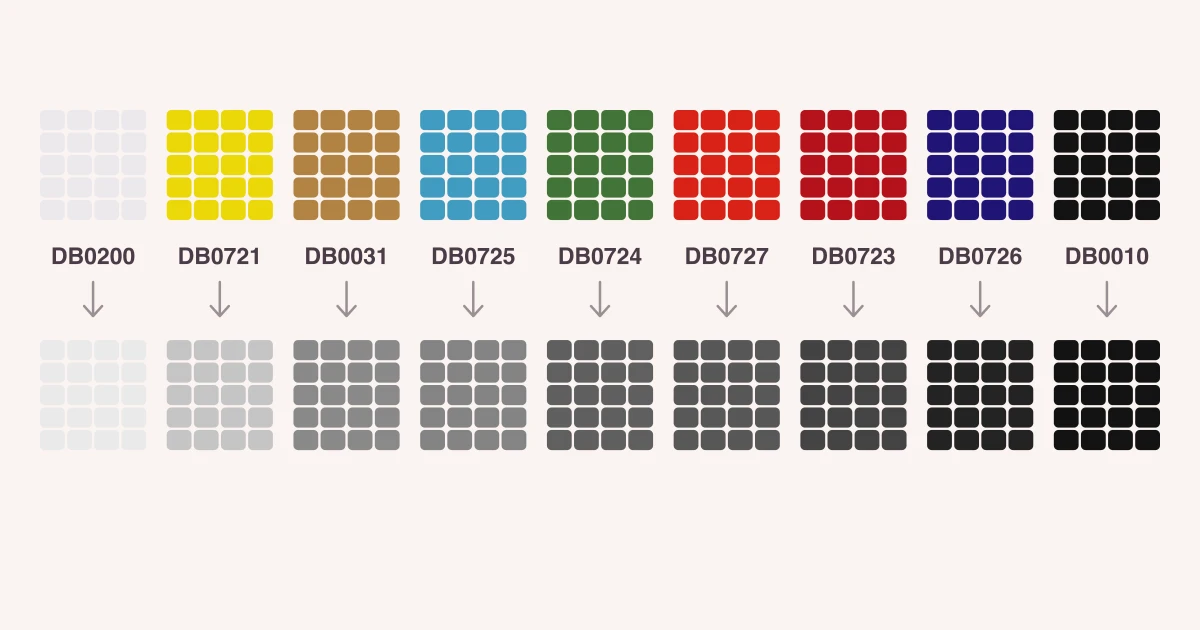
The picture at the top shows nine Delica colours and the same beads in grey. Opaque green (DB0724) and opaque red (DB0727) turn into nearly the same grey. So do 24kt gold (DB0031) and sky blue (DB0725).
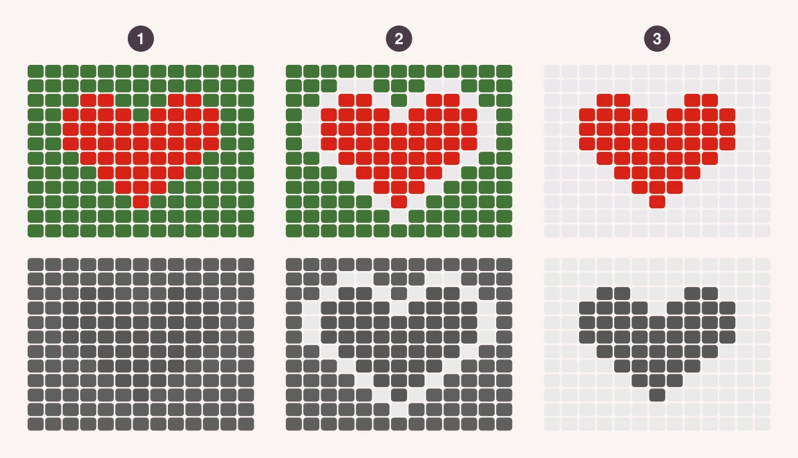
Here is what that does to a design. The same heart in red DB0727:
- On green DB0724. In colour you can see it, but in grey it is gone. From across a room the earring looks like a brownish blur.
- On green, with one row of white (DB0200) around it. The outline does the work. The heart reads again.
- On white. Dark shape, light ground. It reads from any distance.
The grey test
Before you stitch, lay the beads next to each other, take a photo with your phone and switch it to a black-and-white filter. If two neighbouring colours turn into the same grey, the line between them will be weak. Either change one of them for a lighter or darker bead, or separate them with an outline.
Build a small palette
Three to five colours are enough for an earring or a narrow bracelet. More than six and a small piece starts to look noisy, and you pay for tubes you barely use. Give each colour a job:
- Background: the largest area. Keep it calm: white, cream, navy or black.
- Main colour: the motif itself. It needs a clear step in value away from the background.
- Accent: a few beads of something bright or metallic, such as a gold centre or edge. A little is enough.
- Outline (if you need one): only where two areas of similar value meet.
A black outline is not always the best one. A darker bead from the same family is softer: dark red (DB0654) around red (DB0723), or navy (DB0726) around sky blue (DB0725).
The finish changes the colour
Miyuki makes Delicas in well over a thousand colours, and many of them are the same hue in a different finish. The finish decides how a colour behaves in the piece as much as the hue does.
- Opaque (for example DB0723 red, DB0200 white): solid colour, no surprises. What you see on a chart is what you get. Use opaque beads for anything that has to be read: letters, faces, fine outlines.
- Matte (DB0753 red, DB0751 yellow, DB0310 black): no glare, so the colour looks soft and even. Lovely for backgrounds, because a matte ground lets a shiny motif stand out.
- Transparent (DB0704 red, DB0714 blue): light passes through, so the thread shows. In a woven piece transparent beads usually look darker and less even than in the tube. Match the thread to the bead.
- Silver-lined (DB0043 red, DB0042 gold): a mirror-like lining in the hole throws light back. Very sparkly, and it reads brighter than its colour suggests. Best as an accent.
- Luster (DB0201 white luster): a glossy, pearly coat over the colour. Gentle shine that still reads clearly.
- AB (DB0202 white AB, DB0165 blue AB): a rainbow coating that shifts between colours as the light moves. Beautiful in a plain area, but it blurs small details, because each bead shows a slightly different colour.
- Metallic and galvanized (DB0031 24kt gold plated, DB1832 Duracoat galvanized gold): strong shine. Some galvanized and dyed finishes can wear with skin contact and time. For bracelets, the plated and Duracoat versions are the safer choice.
A simple rule: details in opaque or matte, shine in one place. If everything sparkles, nothing stands out. One shiny finish on a matte or opaque ground looks deliberate.
Six Delica palettes that work
All of these have a clear light, a clear dark and one accent. The first five are the colours of our free patterns, so you can see them stitched up.
- Navy and gold: DB0726, DB0031. Two colours and as much contrast as you can get. See the gold stars loom bracelet.
- Nazar blues: navy DB0726, sky blue DB0725, white DB0200, gold DB0031. See the evil eye loom bracelet.
- Teal, navy and white: DB0658, DB0726, DB0200, with a gold DB0031 edge. See the geometric triangle earrings.
- Daisy meadow: sky blue DB0725, white DB0200, yellow DB0721, green DB0724. See the daisy loom bracelet.
- Red, white and gold: DB0723, DB0200, DB0031. See the heart brick stitch earrings.
- Soft pastels with an anchor: pale pink DB1490, sage green DB1496, pale yellow DB1491, and grey DB0652 for the outline. Pastels are all light, so on their own they blur together. One darker colour holds the design.
An ombre is the opposite exercise: one hue, and all the work is done by value. Our ombre chevron peyote bracelet steps from navy to white in six even stages: DB0726, DB1138, DB0730, DB1137, DB1497, DB0200.
The screen is not the bead
A colour on a screen is flat and lit from behind. A bead is glass with a hole, a thread inside it and light bouncing off its curve. So treat any chart, ours included, as a close guide and check the real beads before a big project:
- Look at them in daylight, not under a warm lamp.
- Stitch a small sample of ten beads by ten rows with the colours touching each other. It takes twenty minutes and can save a whole bracelet.
- Check the thread. White thread lightens transparent and pale beads, dark thread deepens them. Our guide to thread and needles has more on this.
- If you swap Delicas for round seed beads, compare the beads themselves, since the codes are different systems. See Delica vs seed beads.
Five mistakes we made so you don’t have to
- All mid-tones. A palette of medium blue, medium green and medium pink has no light and no dark. Add a white or a navy.
- Too many colours. If a colour appears in fewer than ten beads, ask whether a colour you already use could do its job.
- A sparkly background. Silver-lined or AB behind a detailed motif hides it. Swap the background for matte.
- Choosing from tubes. A full tube always looks darker and richer than a single layer of beads. Tip a few out.
- Judging up close. Jewelry is seen from a metre away. Prop the sample up and step back.
Try the colours before you buy them
In the ShineBead app you paint with the Miyuki Delica 11/0 range, each colour with its DB code, so you can test a palette on the real grid of your stitch before spending anything. Save the beads you already own as your own palette, look at the finished piece in a 3D preview, and the PDF lists exactly how many beads of each colour you need. It’s free to start on iPhone, iPad and Android, with up to 3 designs and 5 exports on the free plan.
See the bead pattern maker, or read how to design your own bead pattern for the steps from idea to chart. When you know your colours, the bead calculator tells you how many grams of each to buy.